
So, a little background on how this blog originated…
I was working as a PM at Company X, a new-ish company, which was trying its hardest to be Agile. We diligently created user stories, estimated in points, and, with the help of Excel, tracked and produced presentation-worthy burn-down and burn-up charts for upper management.
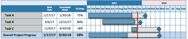
Fast forward 18 months – Company X was purchased by a much larger, older company. Managers from the purchasing company arrived with more traditional views on the development life-cycle and project management. As a result, the original “status” slides were ditched for a slide with a high-level Gantt chart, similar to Figure 1 below. The chart included a top-level row for each work stream; each row contained a shaded area that supposedly represented progress, an end marker, and a vertical red line representing “now.”
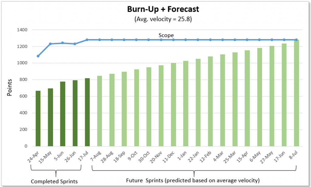
Fast forward another six months – we were presented with the opportunity to revise this “status” slide. We worked meticulously to ensure all user stories were estimated and accounted for in the backlog. At this point, we were able to create a burn-up chart that clearly and accurately showed three things, both at an individual project level and at the program level: 1. The amount of total scope over time, 2. The total amount of scope completed over time, and 3. The estimated end date based on current scope and average velocity.
We then presented this to our manager, who in turn told us something like, “No, we just need a list that shows high level deliverables and delivery month. That will show if we are on track. They [executives] won’t understand a burn-up chart.” My colleague and I left that meeting a bit defeated and confused (how would that show whether we were on track?). I know many people remain committed to traditional management tools, and, in the Agile spirit of respecting people, I recognize and can value this opinion, but to say executives “won’t understand a burn-up chart” seems a bit unfair.
In my opinion, a burn-up chart (Figure 2) not only is more effective but also is more easily understood than a Gantt chart with perhaps just a few minutes of explanation. On the chart, we have three key pieces of information: 1. A line representing the amount of total work scope (and whether it has gone up/down), 2. Bars (or a line) indicating the actual amount of work completed so far, and 3. An estimate, based on current burn rate, of when the work will complete. I believe that a burn-up chart is significantly more valuable and accurate than a Gantt chart as a way of conveying status and highlighting issues (such as scope creep) early.
For example, in Figure 2 below, each green bar represents the total amount of work (points) completed at that point in time – dark green represents actual work completed; the light green represents predicted total work completed based on current velocity. The team estimates that it will finish the current scope of work in July of next year. This snapshot can be updated easily and frequently.
Why is the burn-up chart more valuable than a Gantt chart?
#1: The Gantt chart is outdated
The Gantt chart is old. Do you know how old? More than 100 years old! Henry Gantt created it around 1910-1915. It was created around the time of Henry Ford’s Model T assembly line! Don’t get me wrong – like the Ford’s assembly line, it was revolutionary at the time and remains an important item every manager should learn and understand; in certain situations, it does still have a place. Regardless, it was created long before computers and the ever increasing global and very fast pace world of IT and software development.
#2: The Gantt chart doesn’t keep up with reality
The Gantt chart discourages and fails to show scope change and its impact. I realize some may be happy with the thought of discouraging scope change, but let’s be realistic. In today’s world and on long projects and programs, the truth is – teams rarely know everything at the beginning, and many product owners don’t know everything they want (do you know what you want to eat for dinner exactly 10 months from now? Probably not. Product owners likewise don’t really know exactly what they want 10 months from now either). In this fast pace and chaotic world, needs and wants change quickly, and businesses need to react quickly to competitors. The Gantt chart, again 100+ years old, does not display and account for these quickly changing needs and wants; the burn-up chart accurately reflects and displays total backlog and scope added/removed and its impact to the timeline.
#3: The Gantt chart is difficult to update
The Gantt chart is complicated to update and maintain. While Gantt charts may work at a high level, once you dive into tracking intertwined tasks and additional details, the complexity of the chart makes it very difficult, cumbersome, and time consuming to update and account for any change. I’m sure anyone who has attempted a detailed Gantt chart in MS Project can attest to this frustration. Of course, you can keep it at a high level for simplicity, but now you begin to lose an accurate project status.
#4: The Gantt chart doesn’t evolve with the team
Finally, the Gantt chart does not take into account project and team evolution (from forming to performing) and the team’s improved ability to estimate. The Gantt chart usually outlines a project plan early, and tasks are marked complete. However, the chart itself does not adjust over time for how well the team is estimating and how much work it really completed based on these estimates. Are all those week-long estimates really taking just a week…or more? Or less? The Gantt does not take the answer to this into account and does not adjust accordingly. Additionally, it does not accurately reflect whether code may require significant bug fixing time or very little. The burn-up (and burn-down) chart do exactly this. Because a burn-up can be used in conjunction with velocity to create a forecast, it adjusts over time to take into account the amount of estimated work actually being completed, the team’s ability to estimate, and the quality of that work over time (since buggy code will hurt average velocity)
Of course, I will concede there are times a Gantt chart is ok. For example, setting up new servers. In this case, the specs are set early on and unlikely or unable to change. The plan methodically proceeds down a “to do” list from Task A to Task B and so on. However, for most software development work, Gantt charts are a thing of the past and no longer accurately track and reflect today’s software development cycle. In these cases, it’s time to say, “Goodbye, Gantt.”